
Extreme App Makeover - Appscension Has A New Design For You
Last month, we revealed a preview of the redesign for Appscension. Our clients have been able to explore the changes and prepare their apps. Now, we want to show the new design to all of you.
The new Appscension aesthetic
Larger Images
Appscension’s redesign places a strong focus on your images. Whereas the platform’s classic design featured more thumbnail images, the new design provides new opportunities for larger images to grab the user’s attention. This image-based focus appears on both list pages and detail pages for different types of app content.
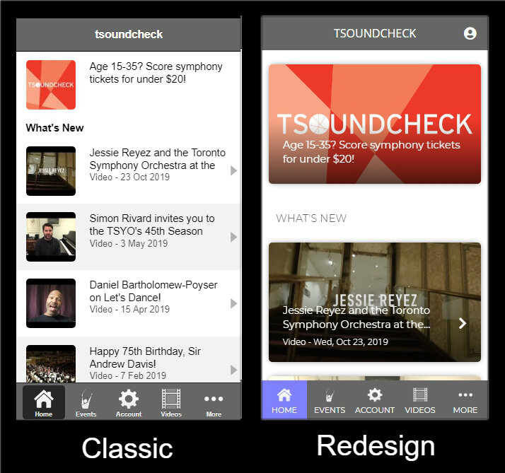
A comparison of the Tsoundcheck app’s home screen - classic view on left and redesign on right.
Lists
In the classic design, we determined how different lists of content appeared in your app - most often with thumbnails. The new design gives you control over the formats for 11 different content lists, including Events and Videos.
Using the Events list, the examples below highlight the five possible list formats. (Click on the examples to see larger versions.)


Content Headers
For content details pages with full-width images at the top, you can choose to have header text appear either as an overlay or below the image. This applies to Productions, Events, At The Venue, Music, and others.

Example: Content header overlay (left) vs content header below (right)
Colors
In the classic design, you had the ability to set a single color for the app header and menu. Appscension’s new design gives you three app colors to reflect more of your branding.
Primary color - Main color in the app theme. Used in: app header, tab bar, collapsible menu.
Secondary color - Second color in the theme. Used in: tab bar selected item, buttons that are not the primary action on the screen.
Action color - Action color in the theme. Used in: buttons that are the primary action, action bar at bottom of details pages, toggle controls.
3 areas with noteworthy changes
Events

Changes:
1. Full-width image
2. One primary action button below image
3. Bar for secondary actions at the bottom - from left to right:
- Program Notes (PDF)
- Share
- Get Directions
- Call Box Office
At The Venue

Changes:
1. Full-width image
2. One menu screen with Social & Offers included
3. Social opens to the Twitter hashtag for the event
Photos

Changes:
1. Full-width images
2. Feed format in reverse chronological order
3. Image titles display below the photo
There are some other changes, but these are the major aesthetic shifts. Now, the real magic happens when you combine these elements with your content to provide audiences with beautiful mobile experiences!
Would you like to learn more?
Let’s talk! We would love to discuss how you can make the most of Appscension’s new design.
Are you currently an Appscension client? Contact Lena.
Would you like to learn more about Appscension? Contact David.